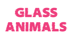
GLASS ANIMALS LIQUID SKY POSTER
This piece helped me learn how to apply effects to text, utilize grids and warping, masking in Photoshop and experiment with color palettes.
This poster is used for marketing materials to promote the Glass Animals Liquid Sky show at Fiske Planetarium in Boulder, CO and was composed during my time as Social Media Specialist. Liquid sky shows at the planetarium give audiences the chance to experience music from their favorite artists while accompanied by large moving graphics and animations projected on to the 8k digital planetarium dome. The target audience and demographic of this piece is primarily college students.

COLOR PALETTE & GRADIENTS:
PROJECT OVERVIEW:
TOOLS USED:
Adobe Illustrator
Adobe Photoshop
PROJECT CATEGORY:
Marketing
Design
Illustration
Vector Art
Advertising
INSPIRATION IMAGES:
The following images were found on Google Images and Pinterest.


The following images served as inspiration for my Glass Animals piece. In order to convey the artist's aesthetic and resonate with their listening audience I researched existing marketing materials and images. I decided to reference a clip from the end of the Heatwaves lyric music video (pictured right).
In order to also tailor the marketing to the planetarium and its audience, I masked an image of our real dome, color graded it to fit the purple aesthetic of the poster and positioned it on the horizon of the design.
IDEATION
For the color palette I settled on a palette from color-hex.com. The palette is called City Sunset Palette I used which I used for the windshield and headlights of the car.
I used the color picker tool in Illustrator to find additional colors I thought complimented the palette for the body of the car, main text of the poster, and overall color scheme of the poster. I chose to incorporate a lot of purple as it is the unofficial color of the planetarium.
COLOR PALETTE


FONTS:


The font used for the main text is Santana-Black. There are three layers of the font in purple and pink to create a shadow so the text stands out on the poster.
To achieve the glitch effect of the text I used the wrinkle tool in Illustrator. I wanted to incorporate the electronic aspect of Glass Animals' music in to the poster.
The use of Santana-Black for "Glass Animals" and Eurostile font for "on the Dome" is well-balanced. The fonts are contrasting enough that they both stand out yet compliment each other well and appear cohesive on the poster.
ADDITIONAL MARKETING MATERIALS

LAYER-BY-LAYER VISUALIZATION

-
The first image is a real picture of a liquid sky graphic from the Fiske dome. These images are actually moving animations that are projected on to the dome during shows.
-
The two radial gradients at the center of the poster are used to give the poster a horizon/ sunset look
-
The use of the grid at the base of the poster was to emulate a 80's retro vibe

Instagram Post
Facebook Banner
